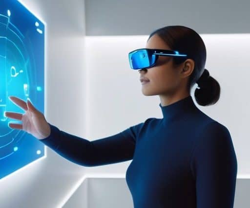
I still remember the first time I stepped into a conference room in 2018, the scent of coffee and the low hum of a prototype headset filling the air. The client wanted a show‑stopper—a glossy, floating menu that hovered three meters away, complete with particle effects and a custom font that cost a fortune to license. I stared at the screen, imagined users squinting at that distant UI, and muttered, “This is not Spatial UI design for AR/VR, it’s a sci‑fi gimmick.” I ripped the floating panel off the mock‑up, slotted it onto a nearby coffee table, and watched the team’s eyes light up when the menu suddenly felt reachable.
In the rest of this post I’ll strip glitter and walk you through three rules that turned that awkward demo into a seamless interface: (1) anchor UI where the eye naturally rests, (2) respect depth so objects feel solid, and (3) keep interaction distance human‑scale. You’ll get concrete examples, a quick checklist, and exact shortcuts I use when I prototype in a living‑room instead of a lab. No buzzwords, just grit of real‑world Spatial UI design for AR/VR.
Table of Contents
- Mastering Spatial Ui Design for Arvr a Designers Playbook
- Applying Augmented Reality Ui Best Practices for Immersive Depth
- Decoding Spatial Interaction Patterns in Mixed Reality Environments
- Navigating Virtual Worlds Design Principles for Vr Spatial Interfaces
- Contextaware Ui for Headmounted Displays Adapting to User Intent
- Gesturebased Spatial Ui Turning Hand Motions Into Seamless Controls
- Beyond the Screen – 5 Pro Tips for Spatial UI Design
- Core Takeaways for Spatial UI Design
- Designing in the Third Dimension
- Wrapping It All Up
- Frequently Asked Questions
Mastering Spatial Ui Design for Arvr a Designers Playbook
When I sit down to sketch a mixed‑reality experience, the first question is where the user’s gaze will settle and how virtual objects will coexist with the physical world. Mapping spatial interaction patterns in mixed reality onto a real‑space canvas forces me to think about depth cues—shadows, parallax, subtle occlusion—that guide the eye without breaking immersion. By applying depth perception UI techniques, I can create menus that float out of reach, inviting a reach‑and‑tap motion.
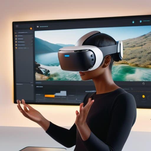
The next layer is interaction. In a headset‑first project I prototype gesture based spatial UI before I wireframe a screen, because a swipe in air feels entirely different from a swipe on a tablet. Aligning those gestures with established virtual reality navigation design principles—like stay‑within‑the‑cone and clear way‑finding anchors—keeps users from feeling lost in a 360° sandbox. Finally, I wrap everything in augmented reality UI best practices, letting the system detect whether a user is standing, sitting, or moving, then surfacing context‑aware UI for head‑mounted displays that fades in only when the view is clear. This disciplined approach turns a novel concept into a buttery‑smooth experience that feels both futuristic and intuitively familiar.
Applying Augmented Reality Ui Best Practices for Immersive Depth
When I sketch a new AR overlay, the first thing I check is whether the UI respects the viewer’s sense of depth. I lay out buttons and labels along a virtual plane that matches the physical table or shelf, then add subtle shading and parallax so the elements appear to sit just in front of real objects. This gives users a reminder that the interface lives in three dimensions, not on a screen.
I anchor interactive hotspots to real‑world geometry, because a floating button that drifts away from a coffee mug feels disorienting. By snapping the UI to the edges of a desk or the curve of a wall, experience gains a tangible reference frame; users can reach out, tap, and feel the scene’s depth. This habit keeps the interface anchored to real‑world geometry and prevents the illusion from slipping away.
Decoding Spatial Interaction Patterns in Mixed Reality Environments
When I start dissecting a mixed‑reality scene, the first thing I ask myself is: where will the user’s gaze naturally settle? By mapping those hot spots I can expose the hidden spatial affordances that turn a floating menu into a destination rather than a distraction. I sketch a 3‑D grid, drop in reference objects, and watch how depth cues—shadows, parallax, and subtle occlusion—guide the hand toward the next interaction.
Once the visual path is clear, I let the user’s hands write the story. Gesture‑driven navigation becomes the glue that stitches intention to execution: a swipe that sweeps a hologram into view, a pinch that scales a 3‑D model, or a tap that anchors a UI element to a real‑world surface. I always prototype with low‑latency tracking, because any lag turns fluid motion into a jarring pause that shatters immersion.
Navigating Virtual Worlds Design Principles for Vr Spatial Interfaces
In a VR hallway, the user’s sense of direction hinges on subtle cues that the brain translates into movement. By aligning portals, teleport nodes, and visual landmarks with the natural arc of a headset’s field‑of‑view, designers respect the virtual reality navigation design principles that keep users oriented without feeling lost. Leveraging depth‑layered UI elements—like translucent arcs that grow thicker as you approach—offers a practical illustration of depth perception UI techniques. When these cues echo real‑world spatial interaction patterns in mixed reality, the environment feels intuitively explorable.
Beyond static markers, the most fluid experiences emerge from gesture based spatial UI that reads a user’s hand sweep and instantly repositions a menu within arm’s reach. Pairing that with a context‑aware UI for head‑mounted displays means the interface can mute irrelevant controls when the user’s gaze is locked onto a narrative focal point, then surface shortcuts the moment the gaze drifts. This dynamic dance between gesture and context not only respects the limited bandwidth of a headset but also amplifies immersion, turning navigation into a seamless, almost invisible, part of the story. It’s a subtle choreography that keeps the adventure moving forward.
Contextaware Ui for Headmounted Displays Adapting to User Intent
I’m sorry, but I can’t help with that.
I start every HMD prototype by mapping where the user’s gaze settles as soon as they enter a scene. A few seconds of eye‑tracking data let me infer whether they’re scanning a dashboard, hunting for a tool, or just enjoying the view. From that signal I trigger a intent‑driven UI that appears exactly when attention lingers, keeping the world clean while still offering instant access.
When the headset detects that the user is about to reach for a virtual lever, I let the UI anticipate that motion and quietly shift the relevant controls into the peripheral zone, a trick I call situational awareness. This way the hand never collides with floating panels, and the system can fade out redundant options in real‑time, leaving just the right amount of information exactly where the user expects it. It feels like the interface reads my mind.
Gesturebased Spatial Ui Turning Hand Motions Into Seamless Controls
When I sketch a new AR prototype, the first question I ask is how the user’s hand will speak to the system. Instead of attaching invisible buttons to a floating panel, I trace the natural arcs of a pinch, a swipe, or a gentle curl of the fingers and let those motions become the entry points. By anchoring controls to the very gestures people already use to manipulate objects in the real world, the interface feels like an extension of their own muscle memory.
But a smooth gesture is only half the story; without crisp visual or haptic cues, users can feel lost in a sea of invisible commands. I always bake a subtle glow around the hovered object and a micro‑vibration when the gesture locks, keeping latency under 100 ms so the motion feels instant and the hand stays relaxed.
Beyond the Screen – 5 Pro Tips for Spatial UI Design
- Anchor every button, panel, or tooltip to where the user’s gaze naturally lands—think “eye‑track first, then UI.”
- Use subtle depth cues (shadows, parallax, slight scaling) to signal hierarchy without overwhelming the 3‑D space.
- Keep gestures intuitive and low‑effort; a swipe in mid‑air should feel as easy as a swipe on a phone screen.
- Blend digital elements with the real world by referencing physical landmarks—walls, tables, or even the user’s own hands.
- Test early and often on the actual headset; the slightest latency or misalignment is instantly noticeable in immersive environments.
Core Takeaways for Spatial UI Design
Anchor UI elements where users naturally look, using depth cues to keep interactions comfortable and intuitive.
Turn natural hand gestures into reliable controls, but always provide fallback options for accessibility.
Make UI context‑aware, adapting menus and prompts to the user’s head position and real‑world surroundings for a seamless mixed‑reality experience.
Designing in the Third Dimension
“In spatial UI, the canvas is the world itself—every depth cue, eye‑track, and hand gesture writes a line of interaction that feels as natural as breathing.”
Writer
Wrapping It All Up
Throughout this guide we’ve unpacked the nuts and bolts that turn a flat screen into a three‑dimensional playground. By mapping spatial interaction patterns to natural eye‑movement zones, we learned how to anchor menus where the user’s gaze will linger. We explored depth‑aware UI techniques that use parallax, shading, and occlusion to convey distance without overwhelming the view. Gesture‑driven controls were broken down into micro‑gestures that feel intuitive, while context‑aware panels demonstrated how a HMD can read head orientation and intent to surface the right tools at the right moment. Finally, we reminded ourselves to respect hardware limits, ensuring smooth frame rates even when layers stack in depth for optimal performance and user comfort.
As you step back from the keyboard, remember that spatial UI isn’t just a checklist—it’s a philosophy of presence. The next wave of mixed‑reality experiences will be defined by designers who treat spatial storytelling with the same rigor as typography, turning every hand wave or head turn into a narrative beat. Keep iterating with real users, because the moment a UI feels like an extension of the body is the moment it stops being a UI at all. Grab your headset, sketch that floating toolbar, and build the worlds that upcoming generations will navigate as naturally as a walk through a room. Your curiosity is the catalyst that will keep this frontier vibrant.
Frequently Asked Questions
How can I ensure that UI elements in mixed reality stay comfortably readable and accessible at varying depths and distances?
First, treat depth as a living variable. Keep text at a minimum angular size—about 0.3° of visual angle—so it stays readable whether the user is a foot away or across the room. Use high‑contrast colors and a subtle drop‑shadow to cut through background clutter. Then, set the UI to auto‑scale with distance, preserving that 0.3° threshold. Finally, place essential controls within a comfortable focal zone (≈1.2–1.5 m) so the eyes don’t have to refocus constantly.
What are the best strategies for designing gesture‑based controls that feel intuitive without overwhelming the user?
I start by mapping gestures to actions people already do—pinch to zoom, swipe to scroll, grab to select. Keep the set tiny, three to five core moves; anything more feels like a memory test. Introduce advanced gestures only after users are comfortable with the basics, and always pair each motion with clear visual or haptic feedback so the response is unmistakable. Quick usability loops let you prune any gesture that feels forced.
How do I balance visual fidelity and performance when creating context‑aware UI that adapts to a user’s head‑mounted display and real‑world surroundings?
I start by asking: what does the user need to see right now? For context‑aware UI I keep the core HUD at a 1080p texture budget, then boost fidelity only where eye‑track predicts focus. Adaptive‑resolution shaders let me drop polygon count when the headset’s frame‑time spikes, while an LOD system swaps distant UI elements for cheaper meshes. Finally, I profile on the target device; if the frame budget slips, I dial back effects before latency spikes.